
Blog Post | Nov 15, 2022
Typography for Non-Designers: Build on the Basics for Better Creative
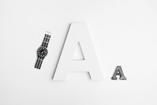
If you're not a designer, you probably don't think much about type. But you should! Here's everything an integrated marketer needs to know about typography to help create or evaluate attention-getting designs.
When type is done right, it's almost invisible: you can easily read a sign, menu or webpage, and you don't spend much time thinking about it. But when type goes wrong, it's almost like a record scratch. A clunky, poorly selected font that's either too small or too crowded can tank an otherwise attractive design. Not to mention, if your audience has to work too hard just to read it, they may give up. Good typography is essential!
So whether you want to add value to your team or you're a one-person integrated marketing department who has to write, design, and distribute marketing communications, we've created a simple guide to understanding the basics.
Let's start by speaking the language – starting with one of the most commonly asked questions, what's the difference between a serif font and a sans serif font (and why it matters):
Serif is a fancy way of saying added strokes or decorative lines on a letter. The serif creates more recognizable shapes on a page so words can be read more quickly, making serif fonts ideal for print, but not so great for digital media. Times New Roman, Garamond, and Bodoni are a few timeless serif fonts.
Sans serif – as you probably remember from your high school French class, sans means without, so sans serif fonts are designed without those extra touches.
Choose a sans serif font for a more modern look and to improve readability on web pages, emails, social media and other digital mediums. Helvetica, Futura, Arial and Grotesk are a few examples of versatile, sans serif font families.
Choosing a Typeface
What about something radically different, you say? "Fad" or novelty fonts can be a bad idea for several reasons, including the fact that they can make your pieces look dated or amateurish. Moreover, unusual typefaces may not always render correctly and, even if it’s only used for headlines, a novelty font may be tough to pair with a traditional font.
We can't emphasize this enough: The first priority of your text should be readability. Fonts can convey a distinctive look, but if you want to make a bold statement, that's what your brand's color palette and library of visual elements are for. When choosing a type, it’s usually best to select a tried-and true-classic, such as those mentioned above.
Let us help you choose the right typography and more for your next print job. We can help you create beautiful printed pieces that stand out and get results.