
How Color Science and Trends Can Help You Shake Up Your Marketing
How color choices influence marketing and how color influences behavior.
It’s no surprise that the use of color can give your integrated marketing an emotional charge. Think of all the times you found your mouth watering at the sight of a red, succulent strawberry or noticed that you felt calmer as you admired the pastel hues in a sunset.
The science of color in marketing is a multi-million dollar global business. It’s equal parts art, anthropology, and psychology. You don’t need to be a designer to appreciate the impact of color and start using it to your advantage, but you do need a basic understanding of how color influences behavior, as well as what influences our color choices in marketing.
Common Themes and Color Schemes
If you’ve ever done a competitive analysis or brand audit of businesses in your industry, you’ve noticed some dominant themes. For example, healthcare marketing is awash in a sea of blues and greens, while the dominant colors in luxury marketing are often shades of red and black.
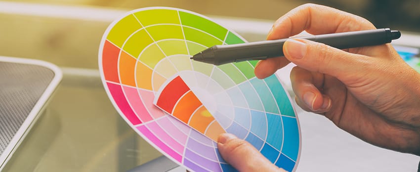
Even though you want your marketing to be original and stand out, context and customer expectations are important considerations for color selection. Color wheels offer a fascinating analysis of usage by industry. Notice that there are no absolutes. For example, blue can evoke masculinity in one product category (automotive) but represent dependability or well-being in others. Conversely, when paired with pink, blue can give the impression of sweetness.
Should You Pay Attention to Yearly Trends?
Each year, Pantone and other influential institutions pick a color (or colors) of the year, inspired not only by fashion and design trends, but even widely shared sentiments. If you’re supporting a brand that is perceived as modern and on the cutting edge, it’s essential to keep up with yearly color trends and forecasts. Most integrated marketers should keep color trends in mind when it’s time to refresh their communications – rather than completely redoing their brand colors, for reasons we’ll explain below.
Easy Ways to Experiment with Color
Even though it seems like the obvious way to stand out from the competition is to zig where others zag and do a 180° with your color palette, that might not be the best solution for two reasons:
- You risk sacrificing all the brand equity you’ve built.
- Retrofitting your marketing with new colors can be expensive and time-consuming.
Instead, test the waters with these simple solutions:
- Use a new hue on your CTAs. Try using different colors for your call-to-action buttons on landing pages and emails, then do some A/B testing. If one color dramatically outperforms the other, then consider bringing it into your brand on a more permanent basis.
- Try temporary touches before you commit. Floor and window clings allow you to add new colors to a retail environment before making big changes. Instead of completely redesigning your packaging, you can use belly bands, packaging sleeves, or starbursts to play with color.
- Overhaul your images. Many stock photo houses let you include color in your search criteria, which is an easy way to incorporate vibrant pops of color without switching your brand up too much. Getty Images even has a curated selection of Color of the Year images.
Let’s Take a Closer Look
Changing your color palette may seem like an easy and obvious way to give your marketing a new look, but you should have concrete objectives in mind and use solid market intelligence to inform your decisions.
Our designers offer the best of all worlds: in some cases, decades of experience combined with an affinity for the latest and freshest trends; and a passion for design as well as deep knowledge of marketing best practices. We’d love to share our portfolio with you and learn more about your needs.